
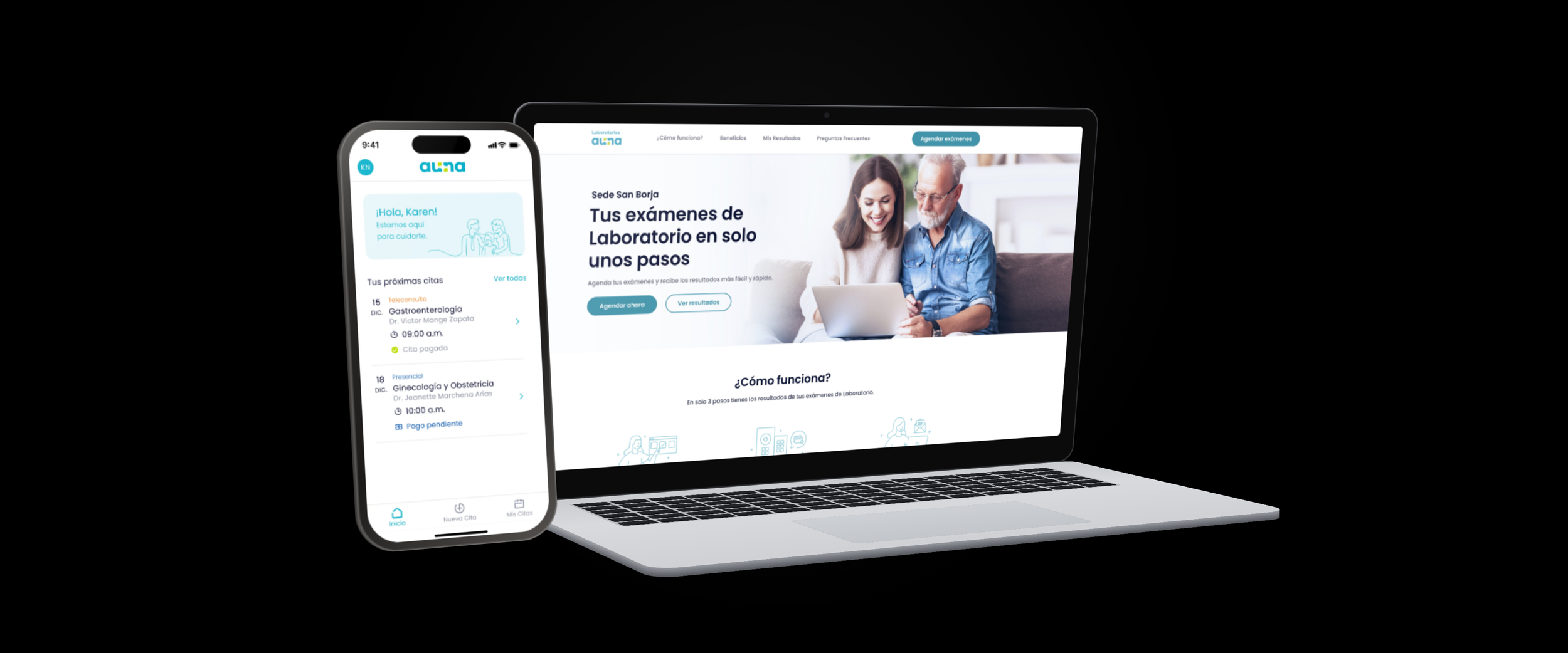
Make it stand outAuna is one of Latin America's largest private healthcare providers - 31 clinics across Peru, Mexico, and Colombia, serving 1M+ patients through their Oncosalud network.
ROLEUX Designer
Jan 2021 – Feb 2022
SCOPEEnd-to-end
Discovery · Scheduling · Results · Web and mobile
UX strategy · Usability testing · Journey mapping
TEAMCross-functional
Service Design, UI, Product, Dev, Healthcare stakeholders
Peru · Colombia
The Challenge
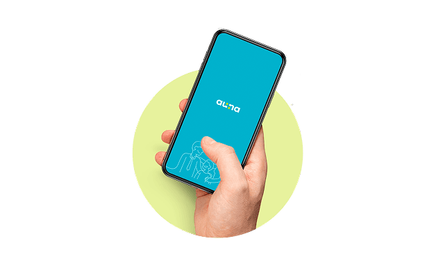
Design a digital lab experience that allows patients to:
Discover available laboratory tests: what they are, what they're for, how they work, and how much they cost
Schedule their appointment seamlessly, via WhatsApp (the dominant communication channel in Peru)
Access their results digitally, without needing to return to the clinic
This wasn't just a UI project. It was the digitalization of a full patient journey that had never existed in digital form before.
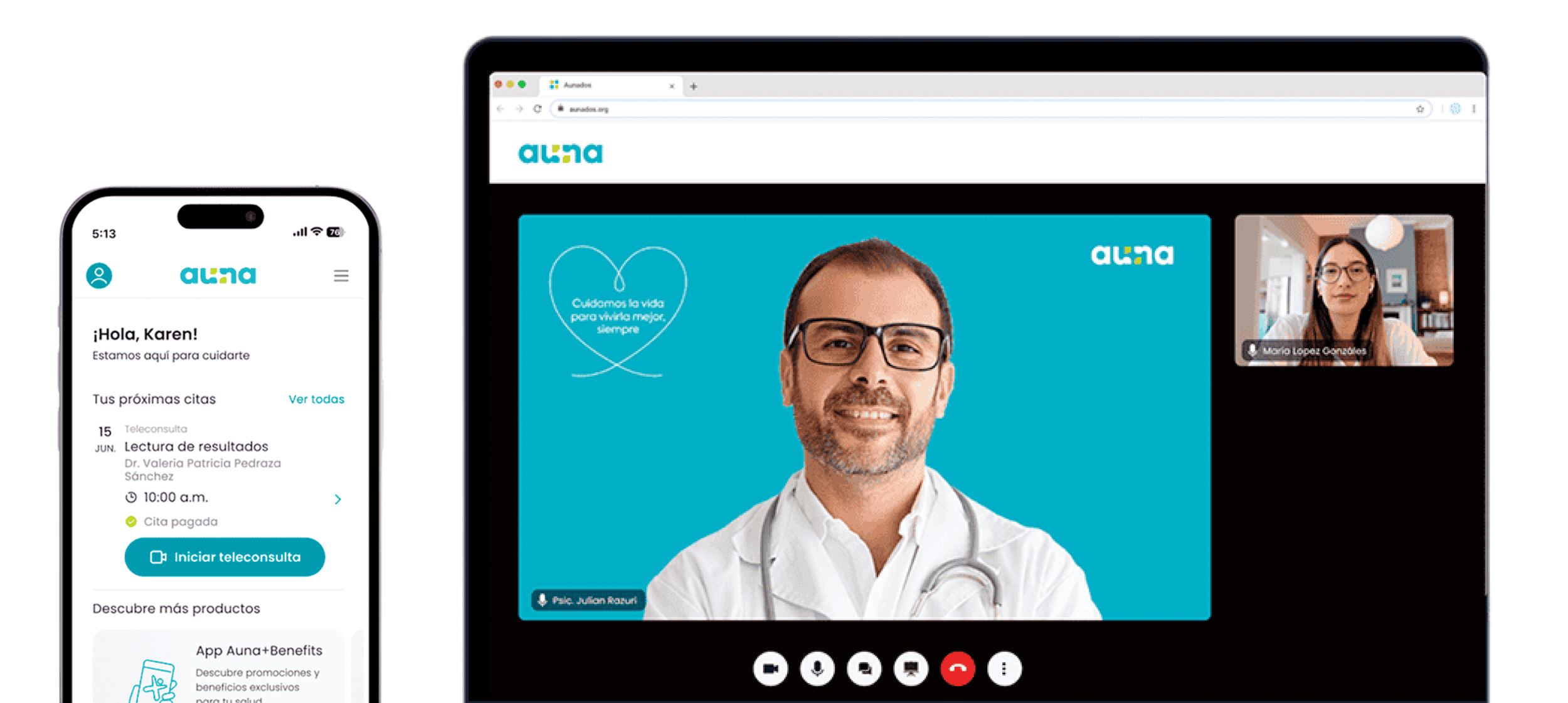
During 2021-2022, at peak COVID-era digital health adoption, Auna App surpassed 100K downloads as patients across the region shifted to digital-first care. The lab experience, however, was still entirely offline: patients called or visited in person to discover tests, schedule, and collect results.
Research & Discovery
To ground our design decisions, we began by:
Mapping user flows for test discovery and scheduling
Running ideation workshops with designers, developers, stakeholders, and selected users
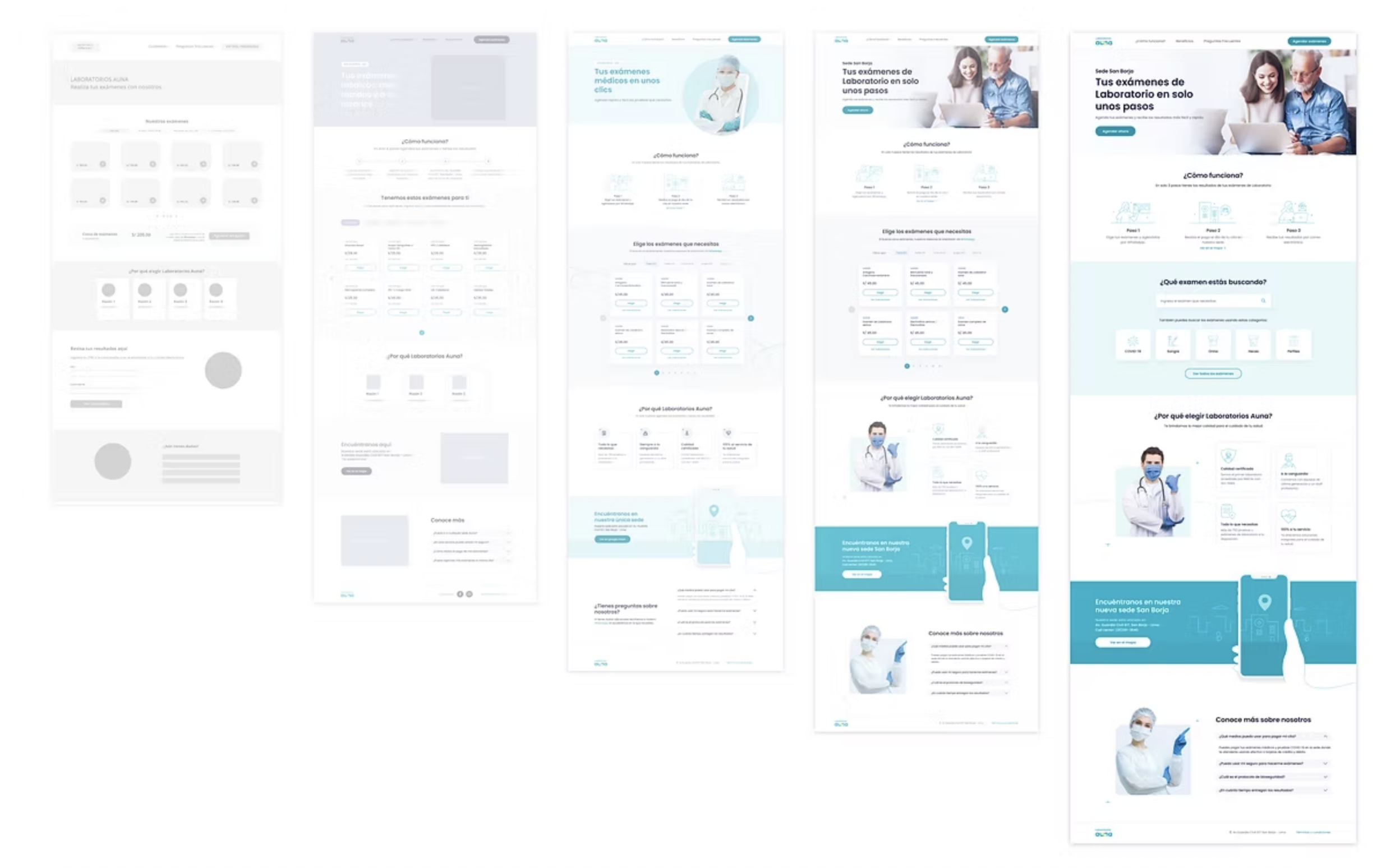
Creating quick low-fidelity prototypes to explore information structure and content hierarchy
Why this was high-stakes design
Healthcare users are not a homogeneous group. They may be anxious about a diagnosis, unfamiliar with medical terminology, older, or low-digital-literacy.
A confusing experience doesn't just frustrate, it can lead to the wrong test being booked, a missed appointment, or results going unread. Every decision had to earn trust and reduce friction simultaneously.
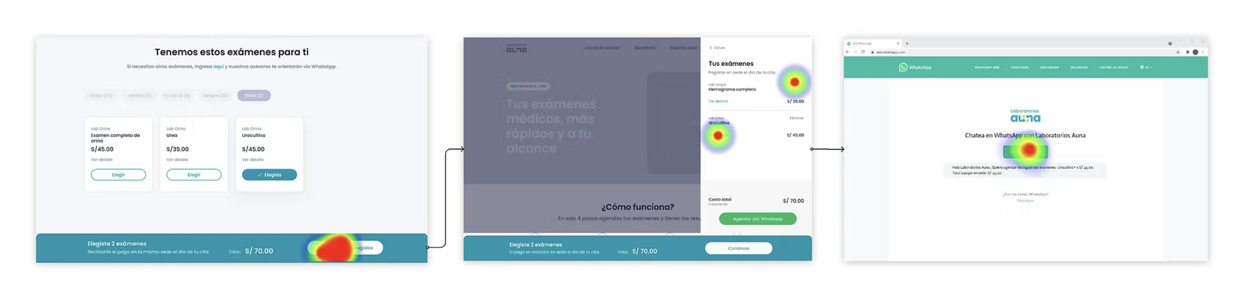
Usability testing
With the page structure established, we designed the primary test scheduling flow and then tested it with volunteers.
These sessions validated interaction patterns, visual clarity, and content comprehensibility before moving into UI design.
Patients tested
25+
via Maze
Method
Unmoderated
remote usability testing
Fast follow
90
days post-launch
MVP Experience
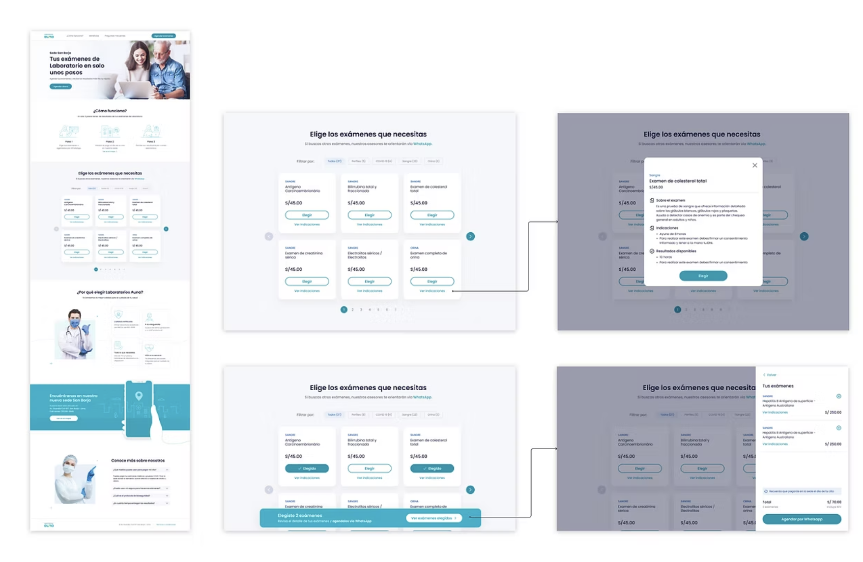
Lab test search: Search by name, category, or symptom. Descriptions, prep steps, and pricing included.
Category navigation: Card layout for users who don't know the test name but know what they need.
WhatsApp scheduling: Direct booking via the channel patients already use daily.
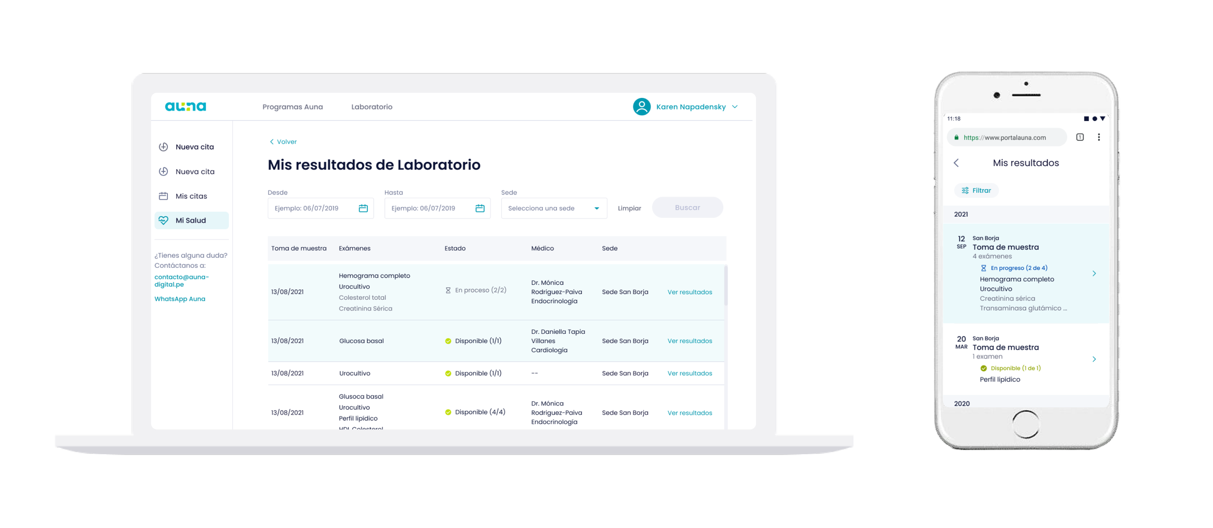
Digital Results
Patients needed an easy way to access to their results without returning to clinic, closing the last gap in an experience that was entirely offline.
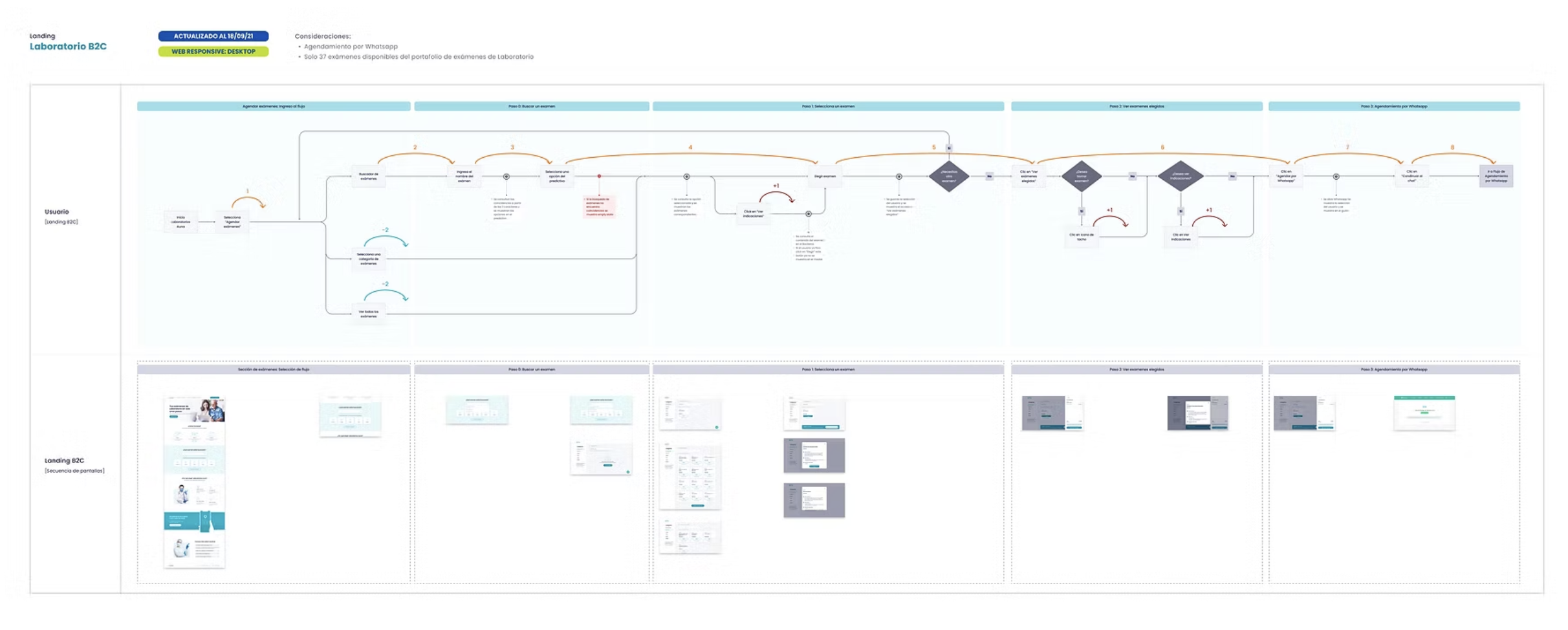
Experience User Flow
End-to-end flow mapping the lab experience across web, from test discovery through WhatsApp scheduling.
Covers 5 key phases: entry navigation (search vs. browse), exam discovery, selection, review, and the digital-to-WhatsApp handoff.
Fast Follow - Learning from the users
90 DAYS POST-LAUNCH
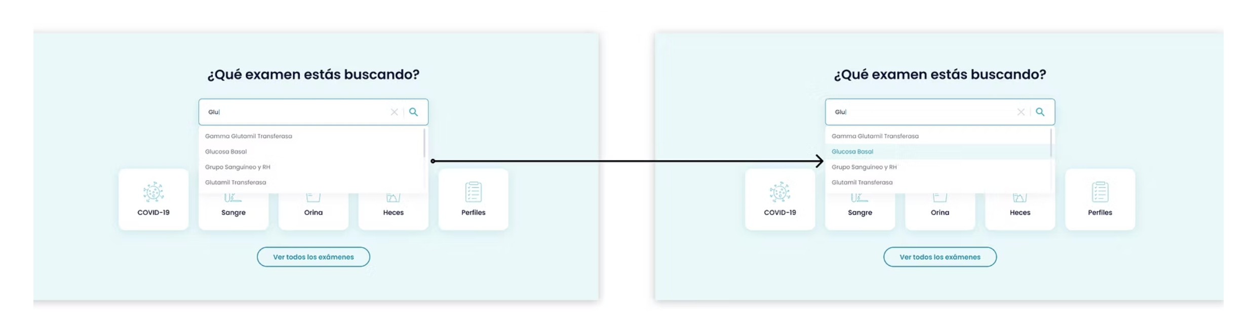
User feedback highlighted the need for a more efficient search experience. We responded by refining the exam section layout and enhancing the search tool, improving usability and reducing friction in the discovery process.